With 56% of American adults owning a smartphone and that number likely to continue rising, responsive design has become a big part of a dramatic shift occurring in web design.
More and more of us surf the Internet from our smartphones, creating both new opportunities and challenges for website owners. Instead of designing for just desktop screens, we now have a variety of smaller screens to take into account. Most of us have experienced straining to view a website designed for a desktop screen from a smartphone. And though newer smartphones are equipped with tools to help navigate these websites, user experience still takes a hit.
One solution is to create a completely separate design for smartphones. Large websites like NBA.com and Amazon.com take this approach. But for smaller organizations, forking out the money for two separate designs may not be practical. Thankfully, responsive design is available as a strong alternative. With this approach, automatic re-sizing and content placement is part of a single design. As the size of the window changes, the imagery, menus, headlines, and text adjusts to fit. This website is built on a responsive design. Go ahead and shrink your window or open it on your smartphone, and you will see how everything moves around.
Responsive design is not without its challenges. As a designer, you have to constantly test everything you are doing on various screen sizes. Does Image A still look good when it shrinks down to the iPhone? Does Headline B look right against the body text and featured image on the Galaxy horizontal view? You get the idea. The more elements you have on your website, the more challenging it is to have everything adjust correctly and fit together on various sizes.
Thankfully, another trend I’m seeing in design – which I fully support – is the movement away from crowded websites. New designs coming online are high on clean looks with vivid imagery and eye-pleasing color patterns that are easy on the eyes and look great on all screens.
Nevada Central Media’s current projects are all using responsive design. And the feature is part of all plans we offer our clients.
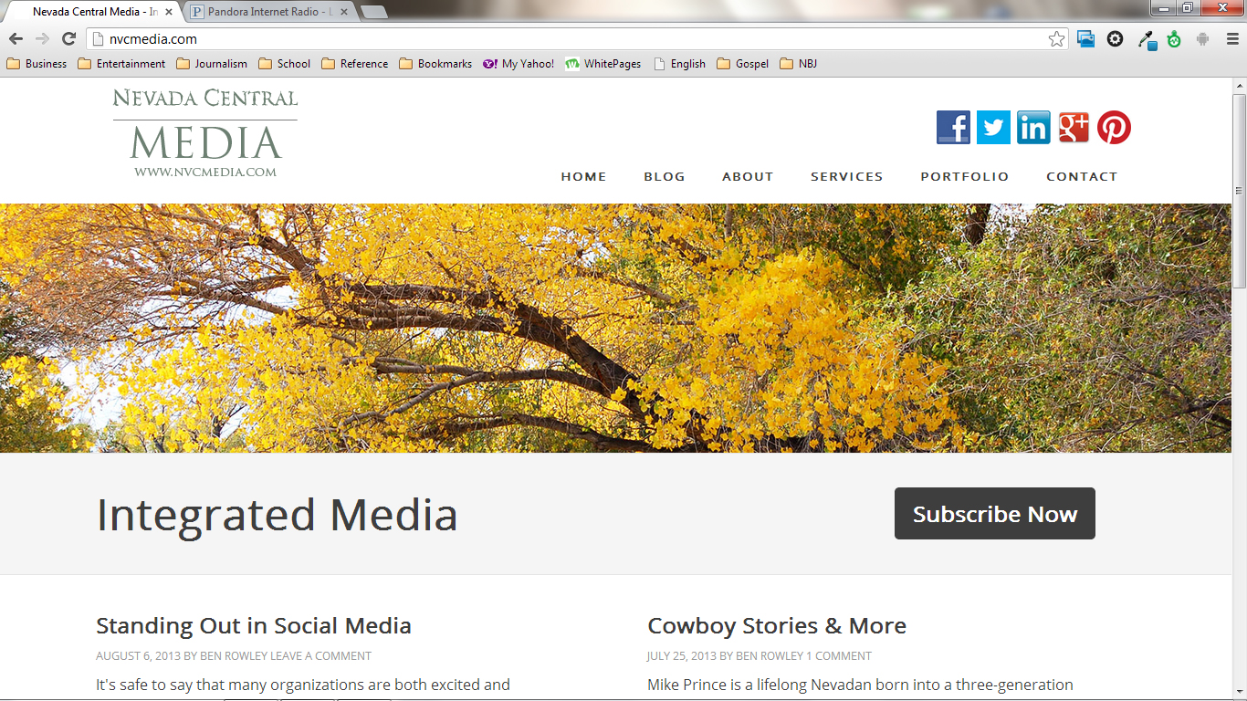
NVCMedia.com on a desktop screen.
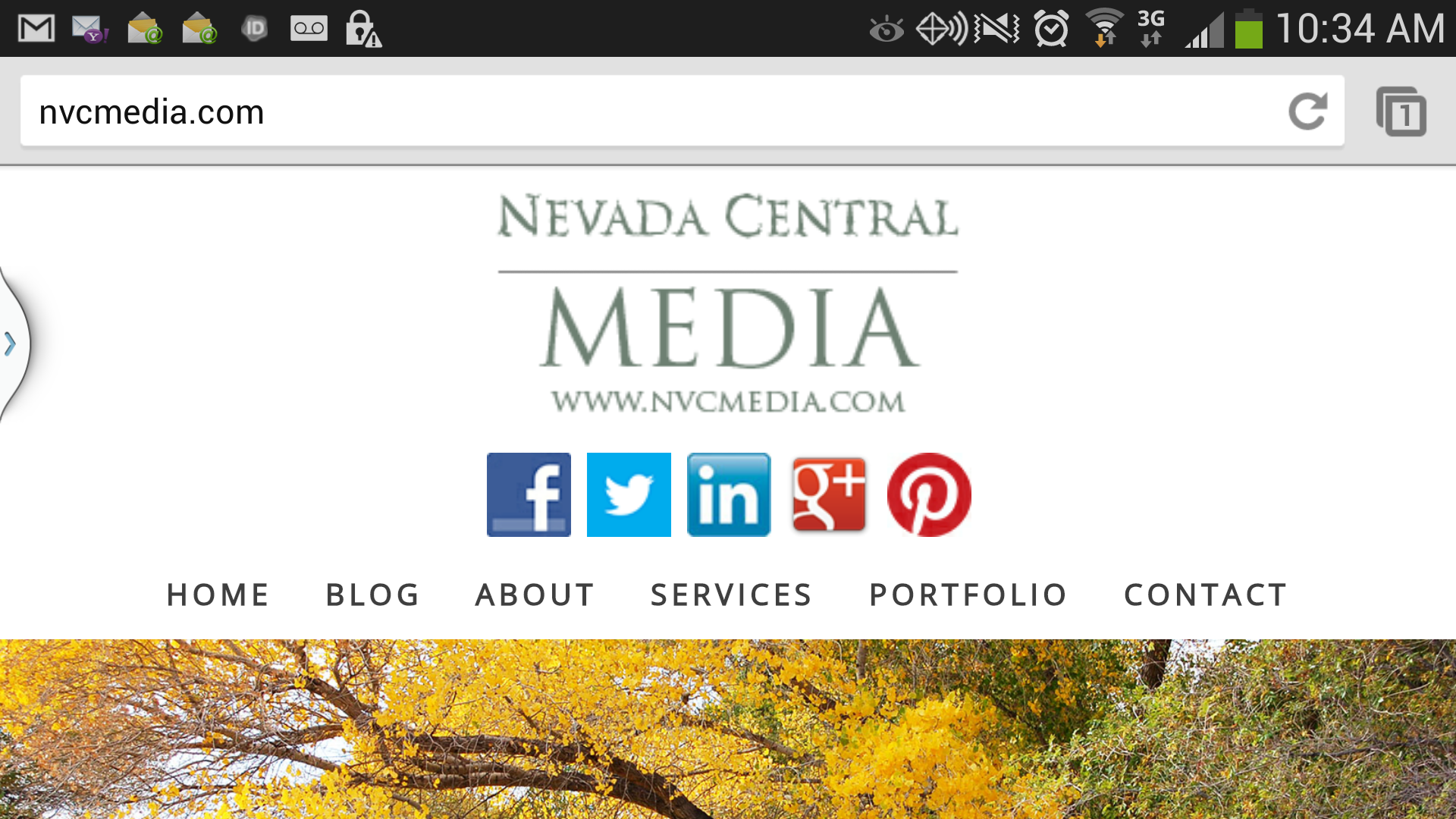
NVCMedia.com on a smartphone screen.