In today’s world it is no secret, your company has to be online to be successful. Having a website is the first key step in getting your online presence started. Your website is your company’s first impression for potential customers or users. Several studies suggest that people make make the majority of their decisions based off of the first impression they have with a product, person, etc. Think of it as if you were going on a first date with that special someone. A lot can go wrong or a lot can go right, but when it comes down to it that first date usually makes or breaks a relationship. So you better make sure you nail it! This article is here to make sure your website doesn’t blow your first impression and cost you potential business.
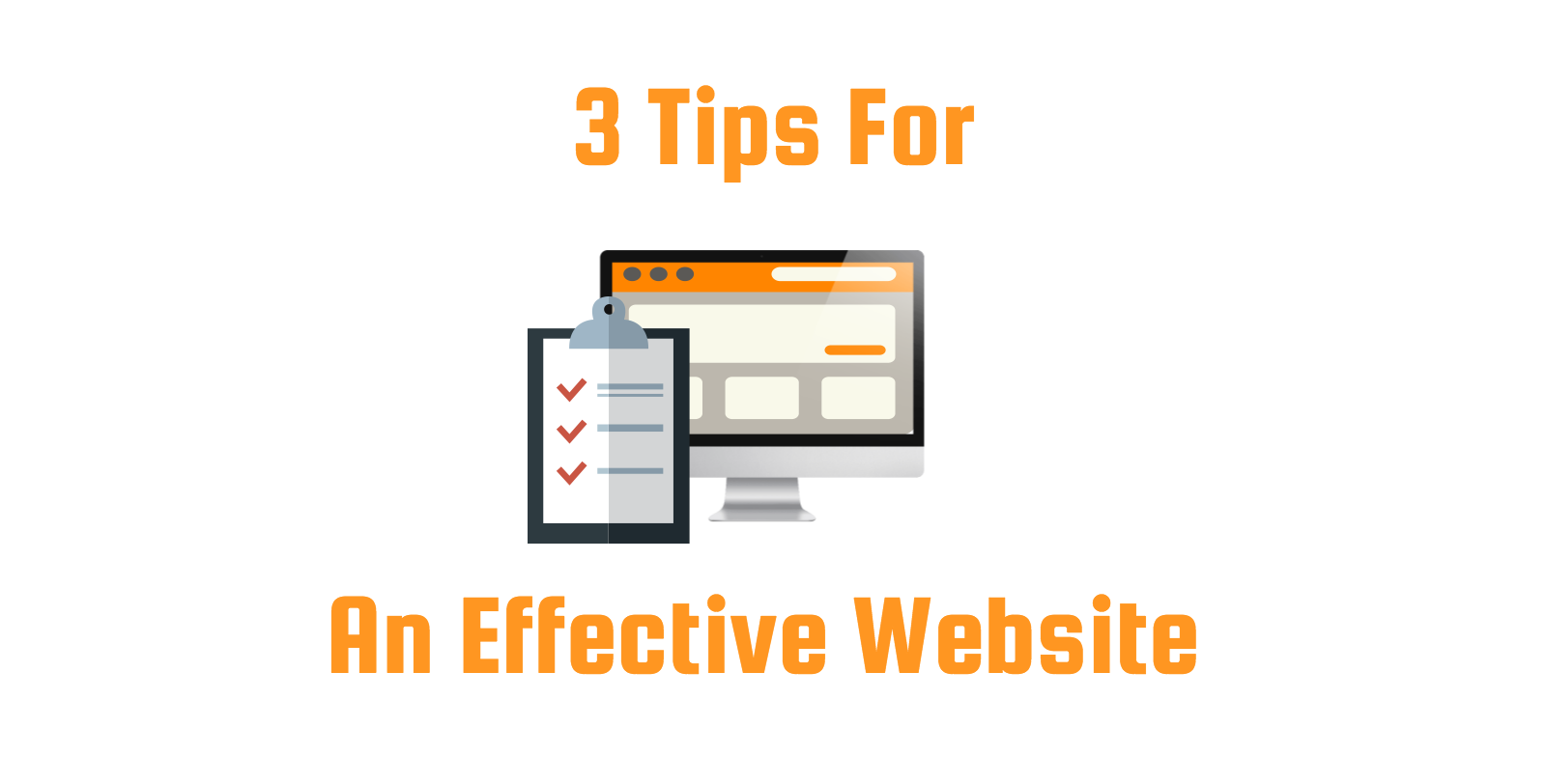
When looking to build a website for a business, many business owners can get so caught up on specific details that they feel are so important that they end up ignoring critical areas that actually do matter. So many people lose sight of what truly matters on a website, and for good reason. There is so much information you can focus on, so many features you can use, and literally infinite combinations of layout structures. To help clear things up a little bit we want to highlight 3 key areas that all websites need to be focusing on in order to convert more sales and connect with their target audience in a meaningful way.
Tip #1 – Make Sure Your Website Has An Effective “Call-To-Action”
This is probably the number 1 area that people neglect when building a website. They fall in love with their content, cool features, and the loads of information they can spew out onto a webpage, but they forget that the whole purpose of having a website is to create action. Whether that action is to buy your product, sign a petition, learn more about upcoming events, sign up for a newsletter, etc. The point is, don’t just spew information, don’t forget the purpose of having a website. Make sure your website has a clear and easy to understand call to action that helps funnel them to your desired goal, such as a contact form to learn more about business services someone offers or whatever it may be. Just remember these 3 things:
- It must be clear and simple.
- It must have an action that is meaningful.
- It must be located in multiple areas throughout the website so viewers can find it easily.
Tip #2 – Your Website Design Must Be Mobile Friendly
This should be no secret anymore, but you would be surprised how many websites are still being built today that aren’t 100% mobile responsive. Our society runs on smartphones and if your website doesn’t operate effectively on mobile devices than you are going to have some serious issues. In fact, according to Google more searches happen on mobile devices than on desktop or laptop computers, so the need is is not only apparent but critical to a website’s success. For those of you who don’t quite know what “mobile friendly” means, pretty much this makes sure your website will automatically adjust it’s size and features to whatever size of screen it is being accessed on. This means they no more dragging and sliding across a website to reach the button or link you are looking for. Everything will shrink and adjust accordingly to make for a more effective and user friendly experience. A few key benefits of mobile friendly websites are:
- Google ranks mobile friendly websites better and is a key factor in their search ranking algorithm.
- Your website looks more professional and attractive on multiple devices.
- Your website will convert more people and make that good first impression by making things easy and simple when operating on a mobile device.
Tip #3 – User Experience Must Be A High Priority
We won’t spend much time on this area because it has been discussed so much lately and there are numerous sources for you to check out online. But in a nutshell this tip is suggesting that when building your website to always focus on the user and how you want them to interact with the website. Your website design must be focused on what the user wants to do or see when they visit your site. For example if your website sells auto-parts online you probably don’t want a bunch of blog posts about cars and trucks to be the first thing people see, you would probably want your products right on the home page so people can get what they are looking for quick and easy. Also a big component of user experience is using tools or features to make their time on the website more effective. So for the same website you may want to add a sorting tool that sorts parts by make and model of your vehicle. This makes things quick, easy, and allows them to see their options in a user friendly way.
Don’t get caught up with just making everything quick and easy, you want to make sure your adding the value of your website to the user. So if your site is focused on a non-profit fundraiser you are going to want to have key information about the fundraiser but you are also going to want to make sure they get a good impression and see good quality content, not just key dates and times. Look at maybe adding a video or an infographic of some kind to help draw the interest of the viewer but at the same time engage them in a meaningful way. The general question you should always ask should be, “what does the user want to see when they come to my website?” and then build your site in that manner.
Hopefully this can help clear up some things and allow you to focus on the right areas when building or re-building your website. Remember to think of it as a first date, make sure you look sharp but always focus on the other person, that’s where results will come from. If you have any questions or need any assistance in developing an effective website for your company or organization please let us know. CONTACT US